Buttons
Instead of relying on simple text links, you can create buttons that can change color on mouseover or appear in bold black-and-white, which are particularly eye-catching for calls to action, like APPLY NOW or LEARN MORE.
The buttons will look like this:
1. Creating a Link and Applying a Class
Highlight the text to be linked and click the insert/edit link button in the toolbar. In the Insert Link dialogue box, choose one of two button options in the Class dropdown.
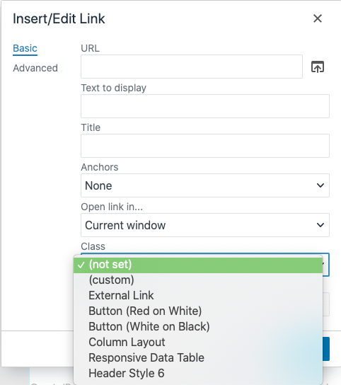
One is 'Button (Red on White)' which is red text on a white background, and the other is 'Button (White on Black)' which is white text on a black background. Select the class an click OK. (If you're linking to an external site, also change the target to 'New Window.)
-
See pagesboxes
-
See pagesbuttons
-
See pagesheadings & titles
-
See pageshero section
-
See pagespage layouts
-
See pages1 Column
-
See pages2 Column
-
See pages3 Or More Column
-
-
See pagespeople
-
See pagesphoto & video
-
See pagessliders
-
See pagestables
-
See pagestabs & accordions
-
See pagesboxes
-
See pagesbuttons
-
See pagesheadings & titles
-
See pageshero section
-
See pagespage layouts
-
See pages1 Column
-
See pages2 Column
-
See pages3 Or More Column
-
-
See pagespeople
-
See pagesphoto & video
-
See pagessliders
-
See pagestables
-
See pagestabs & accordions