Configuring Header Options in Modern Campus CMS
Your site header is a shared, site-wide element that appears at the top of every page. In Modern Campus CMS, header settings are managed in a single configuration file, so a small change (like updating a title or enabling a link area) can affect your entire site instantly.
Most sites will start with this already configured, but you might need to know how to make changes. This article will help you understand what each header option does before you start.
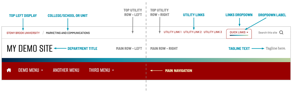
Anatomy of the Header
The header is made up of three main areas:
- the Top Utility Row (the slim strip at the very top)
- the Main Header Row (where your department title and optional tagline live)
- and the Main Navigation (your primary menu).
What You Can Configure
- Top Utility Row Branding (Left): You can choose how Stony Brook branding appears in the top-left area, including whether to display the shield or text-only branding, and whether to include a larger college/school/unit label. If you display a college/school/unit name, you can also set the link destination for that label.
- Utility Links (Top Right): You can optionally display a small set of text links in the top-right utility area. These are best reserved for a few truly high-value links, since your main navigation is the primary place for site menus.
- Links Dropdown (Top Right): You can optionally add a dropdown menu (often labeled “Quick Links”) in the same top-right area, and you can customize the label. This is useful when you have a handful of helpful destinations that don’t belong in the main navigation.
- Department Title and Link: This is the large site title displayed in the main header area. You control both the text and where it links when clicked (most sites point this to the site homepage).
- Optional Tagline: You can choose to display a short tagline on the right side of the main header row. This works best when it’s brief and timeless, since it will appear everywhere.
- Main Navigation: See our article on managing the navigation menu for more information on setting up links for the Utility Links, Link Dropdowns and Main Navigation bar.
- Tags (Internal): The header configuration includes an internal tags field used for behind-the-scenes organization. Tags are not visible to visitors and are optional.
What to Consider Before You Change Anything
- Think site-wide: Header changes affect every page, so prioritize clarity and consistency over novelty.
- Keep it readable: Shorter titles, labels, and taglines reduce wrapping and crowding, especially on mobile.
- Avoid a crowded top row: Utility links and a dropdown can be used together, but the top utility row should stay lightweight.
- Rely on main navigation for depth: The main navigation is where users expect to find your full set of menus and pathways; the utility area should complement it, not compete with it.
Let’s dive into how to configure your header!
Video Tutorial