Configuring Footers
Your site footer is a global, sitewide element that appears at the bottom of every page and plays a critical role in navigation, credibility, and usability. It provides visitors with quick access to important links, contact information, and institutional resources, especially when they’ve reached the end of a page and are deciding what to do next. In Modern Campus CMS, the footer is controlled through a shared configuration file, which means updates made here automatically apply across your entire site.
Why the Footer Matters
The footer is often overlooked, but it is one of the most heavily used areas for secondary navigation. Users who scroll to the bottom are typically looking for specific information such as contact details, policies, or quick links. A well-structured footer reinforces trust, improves accessibility, and supports wayfinding across your site.
Anatomy of the Footer
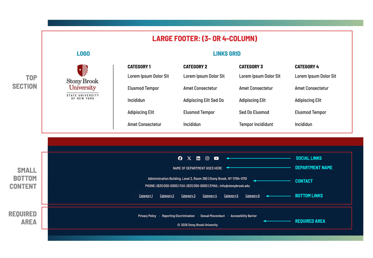
The footer is made up of two main sections: a top content area (optional, depending on layout) and a persistent bottom section that appears in all versions. The below graphic shows how these areas are structured, including link columns, social icons, department information, and required institutional links.
Footer Layout Options
You can choose from three layout styles depending on how much content you have.
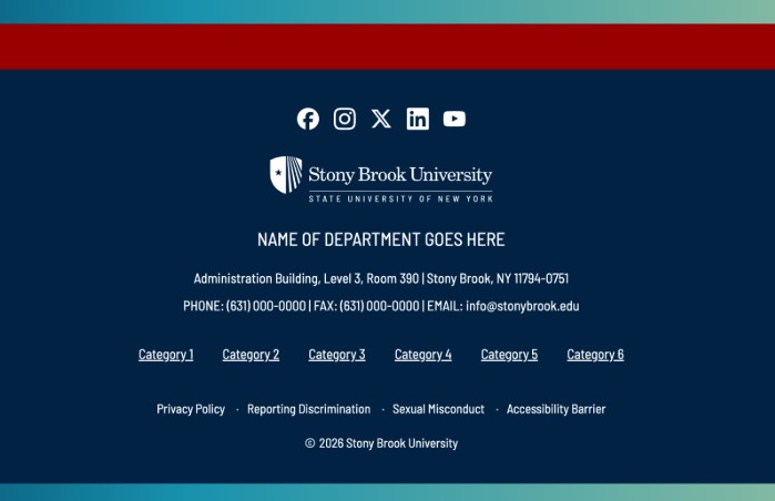
The Small (No Top Grid) layout is the default and provides a clean, minimal footer with no link columns.
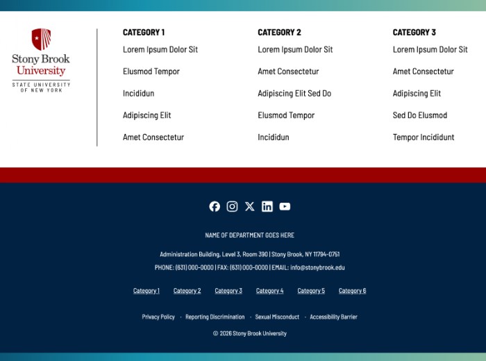
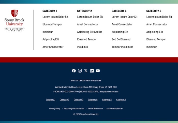
The Large (3- or 4-Column) layouts introduce a top grid of categorized links, allowing you to organize resources into clear groupings such as “About,” “Programs,” or “Resources.”
Keep categories clear and distinct. Avoid repeating links already present in your main navigation. Think of this area as a secondary navigation system for users who scroll rather than click through menus.
Bottom Content Area
The lower portion of the footer is consistent across all layouts. This includes your department name, contact information, social media links, and optional bottom links. This section is where users expect to find authoritative and contact-related information.
Department Name and Contact Information
Displaying your department name reinforces ownership and helps users confirm they are in the right place. Contact information provides a direct next step for users who need assistance. This typically includes address, phone, and email details and appears prominently in the footer’s blue band.
Bottom Links
Bottom links appear between your contact information and the required institutional links. These should be reserved for a small number of high-priority destinations that don’t fit naturally into your main navigation or footer columns. We recommend using these links only when you use the Small footer.
Social Media Links
Social icons appear in the footer and link to your department’s accounts. Each link should include a descriptive, screen reader-friendly title (for example, “Department of English Instagram”) along with the full URL. This ensures accessibility while maintaining consistency in presentation.
Back to Top Button
The optional “Back to Top” button improves usability, especially on long pages. It allows users to quickly return to the top without excessive scrolling and is recommended for most sites.
Required Section
The very bottom of the footer includes required institutional links such as Privacy Policy, Accessibility, and copyright information. This section is standardized and appears in every footer regardless of layout.
Best Practices
- Keep the footer focused and intentional.
- Use clear, concise labels for links.
- Group related links logically if using columns.
- Avoid duplicating your main navigation.
- Prioritize high-value content and remove placeholder or outdated links.
- Always ensure contact information is accurate and social links are active.
Screenshot Walkthrough
Use the screenshot walkthrough below to follow the exact steps for configuring your footer in Modern Campus CMS, including selecting layouts, adding content, and managing links.