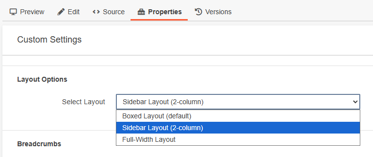
Selecting a Page Layout in Page Properties
When creating a page in Modern Campus CMS, the Page Properties panel allows you to control how content is structured and displayed. One of the most important settings is the page layout, which determines how the content area behaves across the page.
Previously, editors often used layout snippets (such as column snippets) to control page structure. Because layouts are now built directly into Page Properties, most pages no longer need layout snippets. Components can usually be placed directly on the page without wrapping them in additional layout structures.
In most situations:
- Place components directly on the page
- Let the selected page layout control the structure
Using additional layout snippets inside these layouts can lead to redundant markup, incorrect styling, and/or unpredictable spacing. Understanding the three layout options will help you avoid unnecessary snippets and keep your page structure clean.
Full-Width Layout
The Full Width layout allows content and components to extend across the entire width of the page.
Use Full Width when you want components like hero sections, image banners, cards or feature grids, or visual storytelling components to span the full browser width.
In some cases, you may want text content to remain centered and readable rather than stretching edge-to-edge. If so, use a Container snippet within the full-width page. This keeps paragraphs and other text-based content constrained to a comfortable reading width while still allowing other sections to expand across the page.
For example, a page might use:
- Full-width hero component
- Container snippet with paragraph text
- Full-width card grid
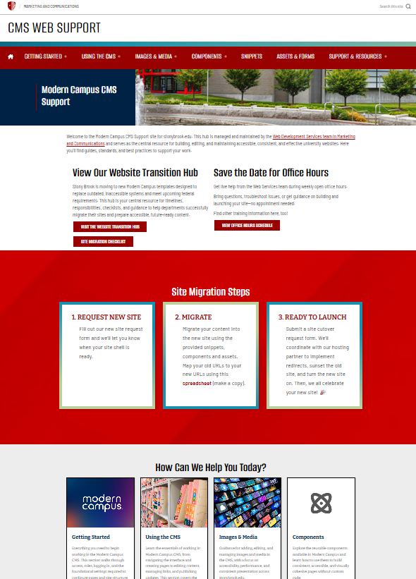
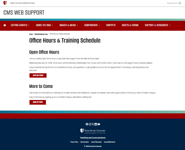
Boxed Layout
The Boxed layout constrains all page content to a centered content area. This layout is ideal for pages that are primarily text-based or informational.
Common examples include:
- Department overview pages
- Policy pages
- Resource pages
- Program descriptions
Because the content is already contained, you generally should not add layout snippets such as column snippets or container snippets inside a boxed layout. Doing so duplicates layout controls and can cause unnecessary complexity or alignment issues.
In most cases, simply place components directly on the page within the boxed layout.
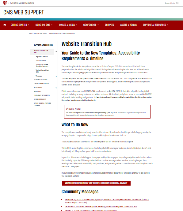
Sidebar Layout
The Side Navigation layout adds a persistent navigation menu on the left side of the page while the main content appears on the right. This layout works best for sections with multiple related pages that users may want to navigate between easily.
Typical uses include:
- Documentation sections
- Department information sections
- Multi-page guides
- Resource hubs
The side navigation automatically reflects the structure of the section, helping users move between related pages. As with boxed layouts, layout snippets are rarely necessary when using this layout.
Summary
- Use Full Width when you want visually rich sections that stretch across the page.
- Use Boxed when your page is primarily informational and should remain centered.
- Use Side Navigation when users need to navigate between multiple related pages within a section.
In all three cases, components can usually be placed directly on the page without wrapping them in layout snippets. Only use a Container snippet within a full-width page when you specifically want to constrain certain content to a centered reading width.
Accessibility and Title II Considerations
This page uses a 2-column container snippet to show the different layout options and screenshots. It uses a table structure to create layout columns. While this has historically been a common technique in some CMS environments, it introduces accessibility considerations that are important under WCAG 2.2 AA and Title II digital accessibility requirements.
In this snippet, the table is not presenting tabular data. Instead, it is being used purely to position content in two columns. Assistive technologies, particularly screen readers, interpret <table> elements as data tables. When a screen reader encounters a table, it expects rows, columns, and relationships between cells. Because the table in this snippet is being used only for layout, those relationships do not exist. This can make the content harder to interpret and navigate for users relying on assistive technology.
For example, a screen reader may announce the table structure before reading the content, interpret the header row incorrectly, or read the page content in a way that does not match the intended reading flow. In complex layouts, this can create confusion about how different pieces of content relate to each other.
Under WCAG guidance, tables should only be used when the content itself is tabular, such as schedules, comparison charts, or datasets where rows and columns represent meaningful relationships. When tables are used strictly for layout, they introduce unnecessary structural markup that does not reflect the semantic meaning of the content.
Because of this, layout tables should be avoided whenever possible when building new pages. Instead, page structure should be handled through:
-
Page layout options in Page Properties (Full Width, Boxed, or Side Navigation)
-
Responsive components designed for structured content
-
Container snippets only when grouping content is necessary
The goal is to ensure that the HTML structure reflects the meaning of the content, not just its visual presentation. This approach improves compatibility with assistive technologies, supports responsive behavior across devices, and aligns with the accessibility expectations under Title II.
In practice, this means editors should rely on page layouts and components first, and only use container snippets when they are needed to group or constrain content within a section of the page. When containers are used, they should support the logical structure of the page rather than replace it with layout-based tables.