LOGO GUIDELINES
The University logos are not to be adjusted or modified in any way. The shield and wordmark elements should not be separated. It is only in rare pre-approved instances that these two elements shall appear unconnected. The shield may not be incorporated into any other shapes or used as a letter within a word under any circumstance, except for the one-time exception of the graphic treatment of our Mantra. Downloadable files of key elements are available in the Design Assets section of this site.
Approvals
The Office of Marketing and Communications is available to review materials prior to production and ensure they reflect the Stony Brook University brand. If you have questions about the acceptability of any materials you are producing, we are glad to provide guidance on our graphic standards policies.
Questions? Please contact Karen Leibowitz, Art Director: Karen.Leibowitz@stonybrook.edu
Primary University Logos
All primary University logos exist in all three versions: horizontal, vertical and stacked.
DOWNLOAD PRIMARY LOGOS FOR PRINT | DOWNLOAD PRIMARY LOGOS FOR DIGITAL
HORIZONTAL

VERTICAL

STACKED

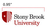
Minimum Sizes
All logos must meet these minimum size requirements to ensure the integrity and legibility of our marks.
SHIELD MINIMUM SIZE

HORIZONTAL MINIMUM SIZE
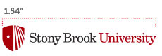
VERTICAL MINIMUM SIZE
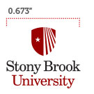
STACKED MINIMUM SIZE
Color Variations
All secondary University Logo color variations exist in all three versions: horizontal, vertical and stacked.
DOWNLOAD RED-ON-WHITE LOGO FOR PRINT | DOWNLOAD RED-ON-WHITE LOGO FOR DIGITAL
1-COLOR (STONY BROOK RED ON WHITE BACKGROUND)

DOWNLOAD BLACK-ON-WHITE LOGO FOR PRINT | DOWNLOAD BLACK-ON-WHITE LOGO FOR DIGITAL
1-COLOR (BLACK ON WHITE BACKGROUND)

DOWNLOAD 2-COLOR LOGO FOR PRINT | DOWNLOAD 2-COLOR LOGO FOR DIGITAL
2-COLOR (RED AND WHITE ON DARK BACKGROUND)
![]()
DOWNLOAD WHITE-ON-DARK LOGO FOR PRINT | DOWNLOAD WHITE-ON-DARK LOGO FOR DIGITAL
1-COLOR (WHITE ON DARK BACKGROUND)
![]()
Sub-Brand Logos
These are the ONLY approved sub-branded logos. Any alteration, substitution, or manipulation of these logos is prohibited. Sub-brand logos should not be used in a lockup with DARE TO BE.
DOWNLOAD SUB-BRAND LOGOS FOR PRINT | DOWNLOAD SUB-BRAND LOGOS FOR DIGITAL
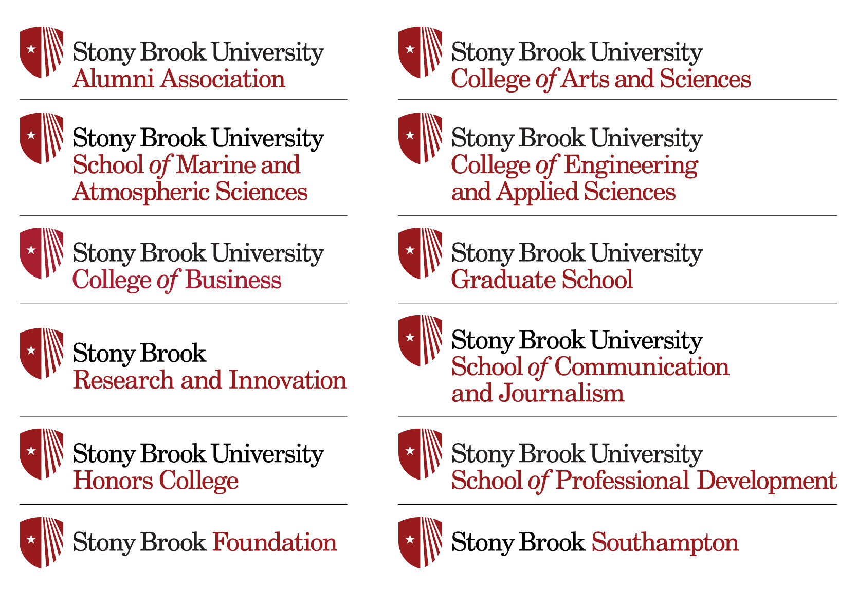
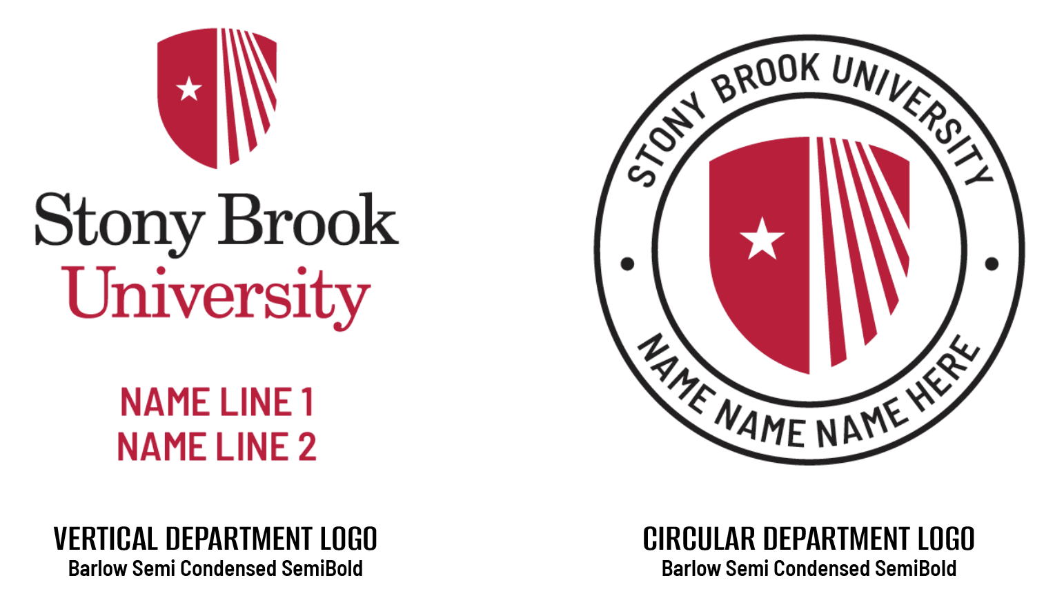
Department Logos
The name of a department, club, organization or program should always appear as a text-only element, separate from the Stony Brook University logo.
The departmental treatment is only to be used when there is no opportunity to treat the secondary name in text separate from the Stony Brook University logo. In these cases, a Stony Brook logo file with the secondary name properly positioned, as shown below in the vertical or circular treatments, will be provided upon request.
For use on branded promotional products, licensed Stony Brook vendors have access to this template and can create the logo for your order.
Questions? Please contact Jaime Woll, Graphic Designer and Licensing Manager, Office of Marketing and Communications: Jaime.Woll@stonybrook.edu
Please choose from EITHER the vertical OR circular treatment:
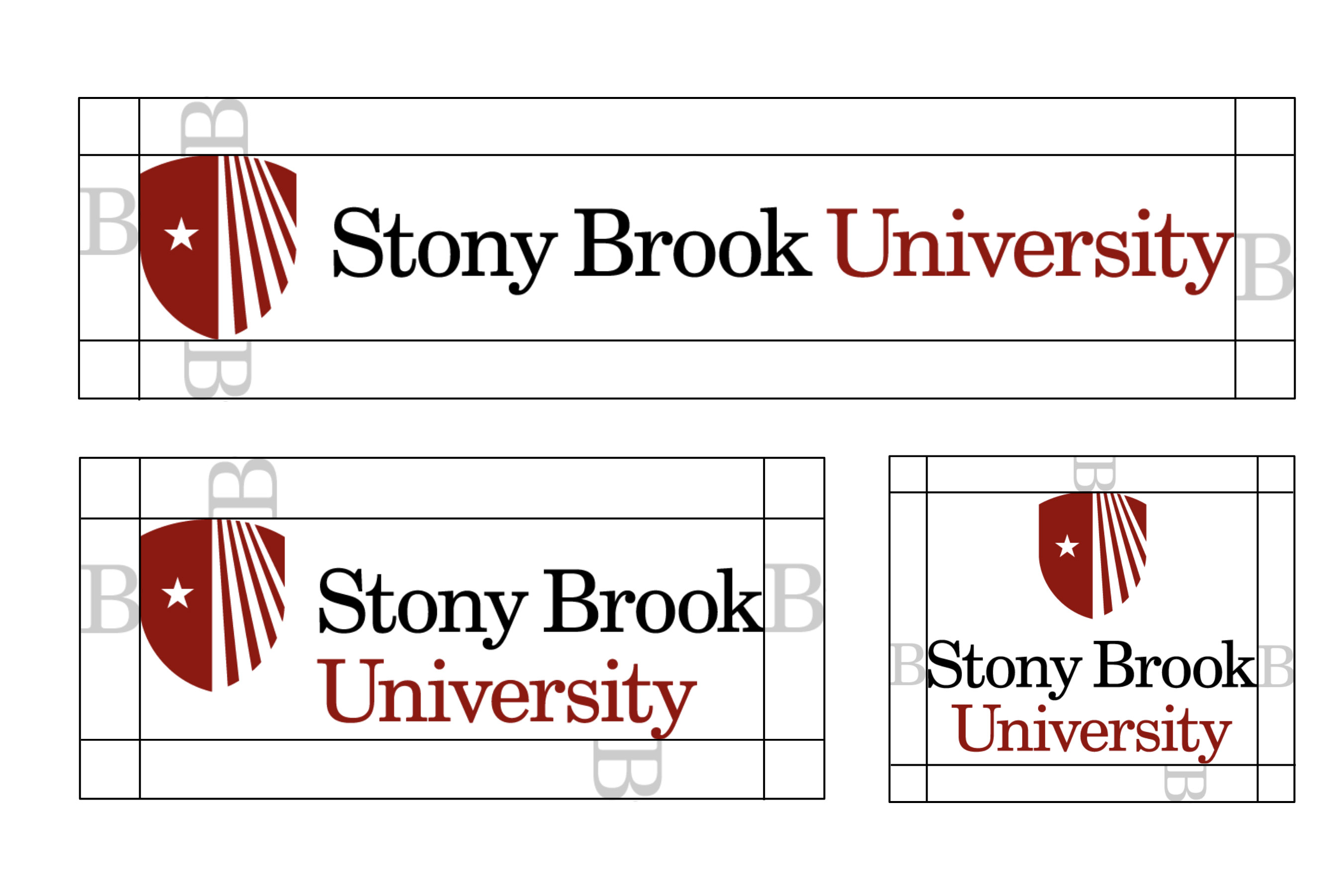
Clearspaces
Clearspace around the logo is determined by the width of the “B” in the Stony Brook wordmark around the highest and widest points in the logo.
Logo Don'ts
Our logo needs to be used with care to ensure it retains its value. It should never be used in any of the ways shown below.
The shield and wordmark elements should not be separated. It is only in rare pre-approved instance that these two elements will appear unconnected.
The shield may not be incorporated into any other shapes or used as a letter within a word under any circumstance.
![]()
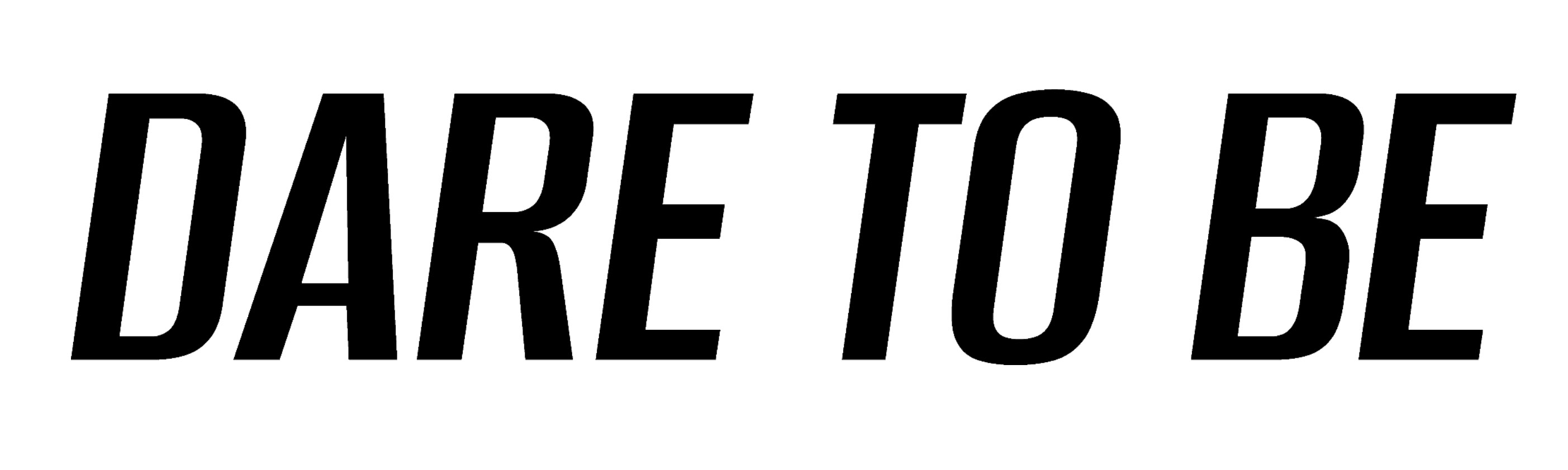
Tagline: Dare To Be
The primary tagline set in Alumni Sans in SemiBold Italic and always horizontal when used on its own or in the logo lockup.
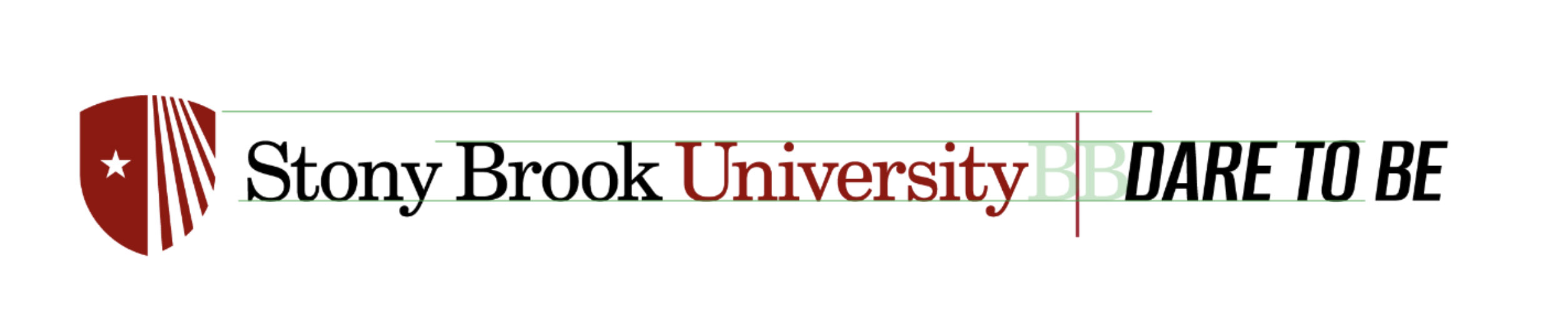
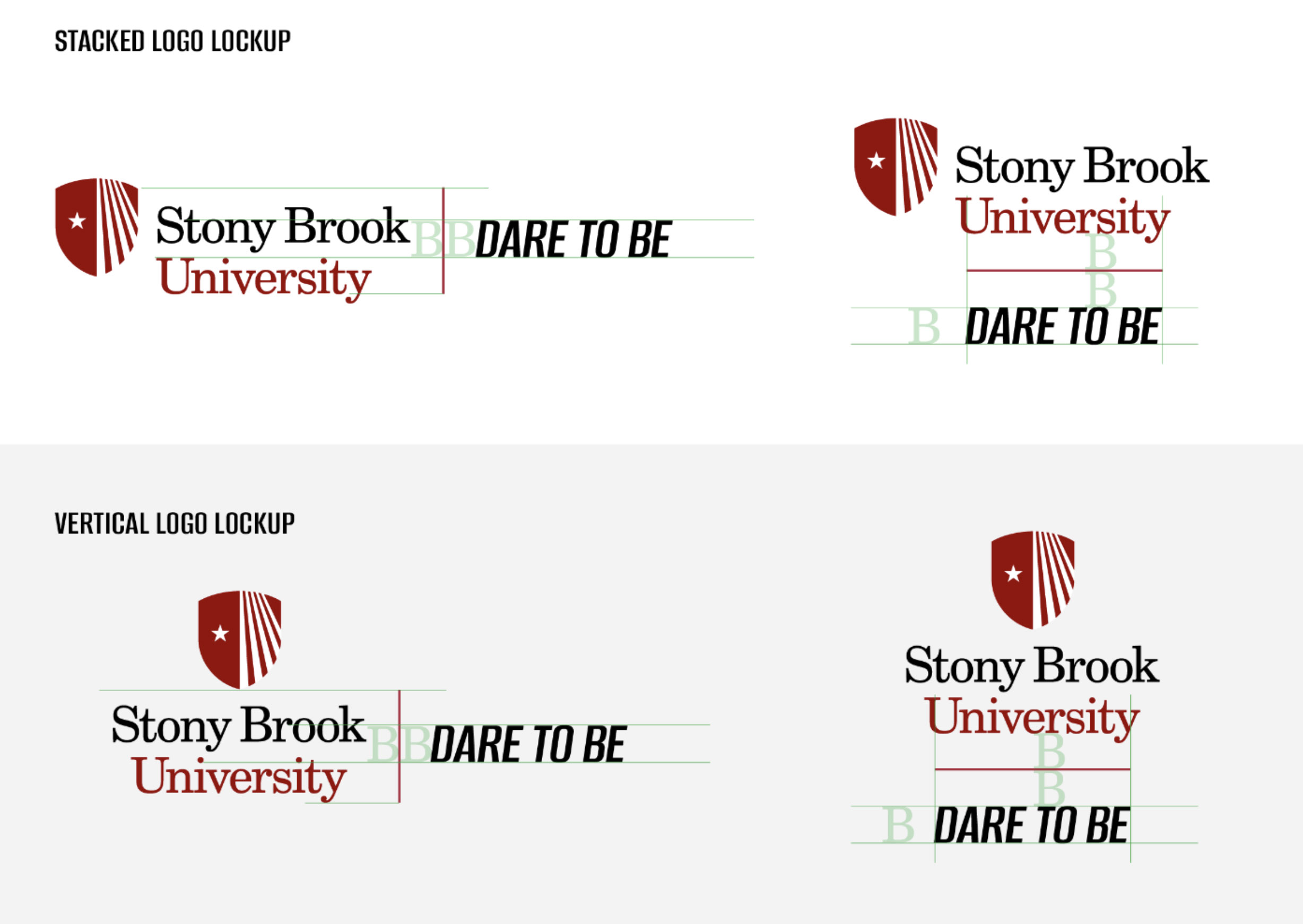
Tagline With Logo Lockup
The Dare To Be tagline and Stony Brook University logo lockup is separated by a vertical line. The spacing is determined by the width of the uppercase B in the Stony Brook logo.
Uses
The full phrase “Dare to Be” should only be used a maximum of two times in a marketing layout, as long as one of those times is the tag in the logo lockup shown here.
Secondary Stacked
Our stacked tagline logo lockup has the Dare To Be tagline below the logo separated by a thin divider. The spacing is determined by the uppercase B in the Stony Brook logo.
Logo Don'ts
These rules apply to the Dare to Be tagline and lockup.
![]()
Logo File Format Usage
The below chart shows what file formats are recommended for various design and software applications. Please note that EPS and PDF are vector images, while JPG and PNG are raster images. Vector images can be enlarged or reduced to any size without losing quality. Raster images can be reduced in size, but not enlarged; enlarging them will result in poor reproduction.
![]()