COLOR GUIDELINES
Questions? Please contact Karen Leibowitz, Art Director, Marketing and Communications:
Karen.Leibowitz@stonybrook.edu
These guidelines outline the information you’ll need to properly express the University brand colors. We have provided a series of color formulas to ensure that each brand color is rendered appropriately and consistently across digital and printed media.
When creating and viewing files on your computer, set your application and screen to the sRGB color space.
When matching official brand colors, start by reviewing the Pantone Matching System (PMS) chip from a current Pantone color book. This is the only reliable guide for how the official color should appear.
When printing a brand color, be sure to compare a test print to the approved PMS chip as different printers will render color differently. Adjustments to your design’s CMYK values may be needed to calibrate your printed output in order to achieve the intended result of matching the Pantone chip. When rendering a brand color digitally, use the HEX value as your primary formula. We’ve provided a RGB value for instances where that is not an option.
Remember: the PMS chip from a current Pantone color book is the only official version of each color. The following guidelines intend to provide the tools to best simulate that color in a variety of media, but your final work should always be adjusted to match the official PMS chip.
Primary Colors
Stony Brook Red and Stony Brook Black are the primary brand colors and should be clearly featured when color is used. These are also the colors used in the primary University logo.
| STONY BROOK BLACK For digital: HEX #000000 RGB 0/0/0 For print: PMS BLACK CMYK 0/0/0/100 Rich Black: CMYK 60/40/40/100 |
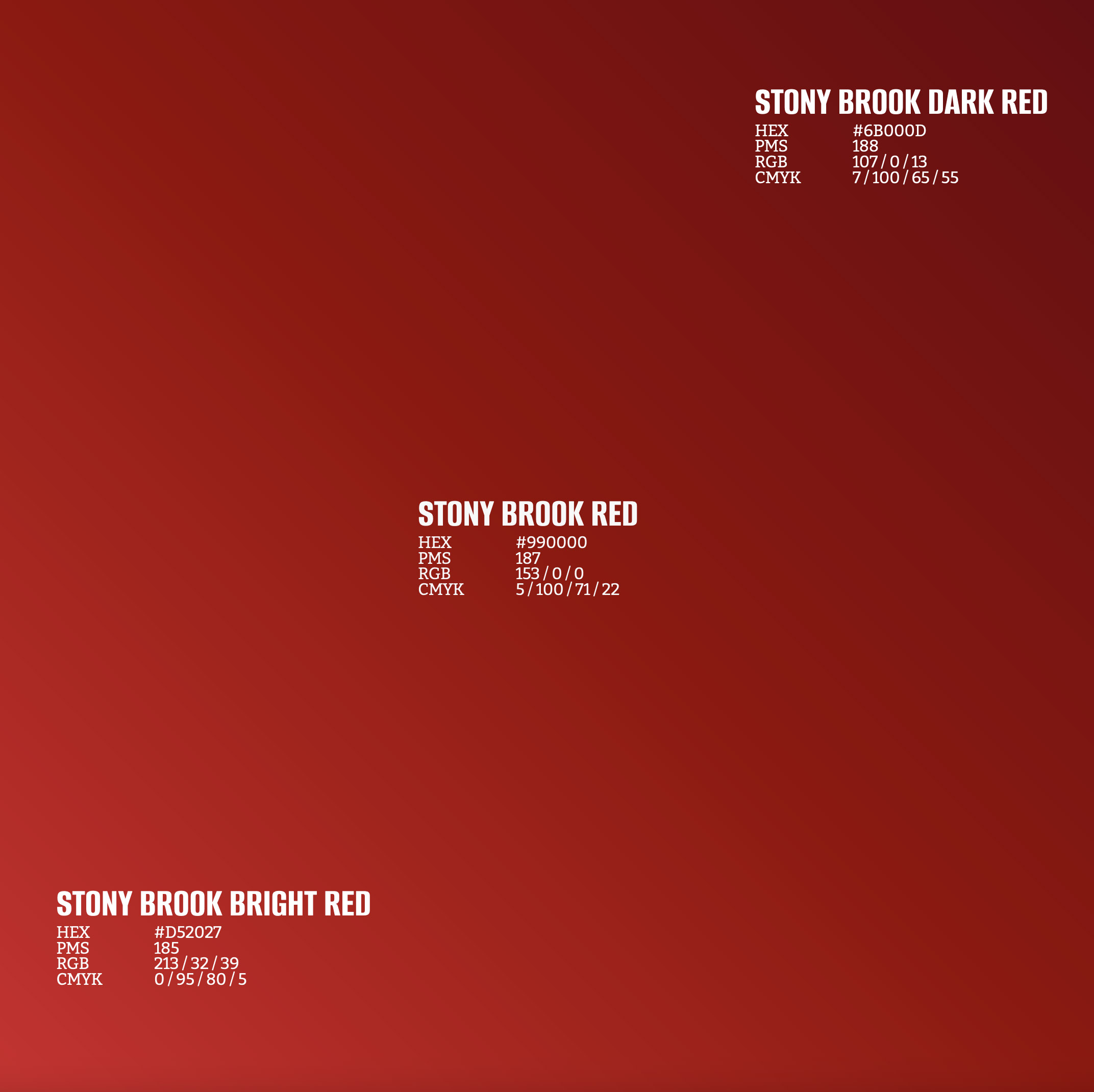
| STONY BROOK RED For digital: HEX #990000 RGB 153/0/0 For print: PMS 187 CMYK 5/100/71/22 |
Secondary Colors
These colors play a supporting role in the brand hierarchy. They are only to be used in support of the primary colors, and may be paired with each other to achieve a more dynamic design. Proportion of reds to non-red secondary colors should be 80:20. This can be achieved through the Prisms in addition to other elements in the design.
COLOR DETAILS |
|||
| STONY BROOK DARK RED For digital: HEX #6B000D RGB 107/0/13 For print: PMS 188 CMYK 7/100/65/55 |
STONY BROOK NAVY BLUE For digital: HEX #002244 RGB 0/34/68 For print: PMS 289C CMYK 100/86/43/48 |
||
| STONY BROOK BRIGHT RED For digital: HEX #D52027 RGB 213/32/39 For print: PMS 185 CMYK 0/95/80/5 |
STONY BROOK ROYAL BLUE For digital: HEX #00549A RGB 0/84/154 For print: PMS 7686C CMYK 100/73/0/10 |
||
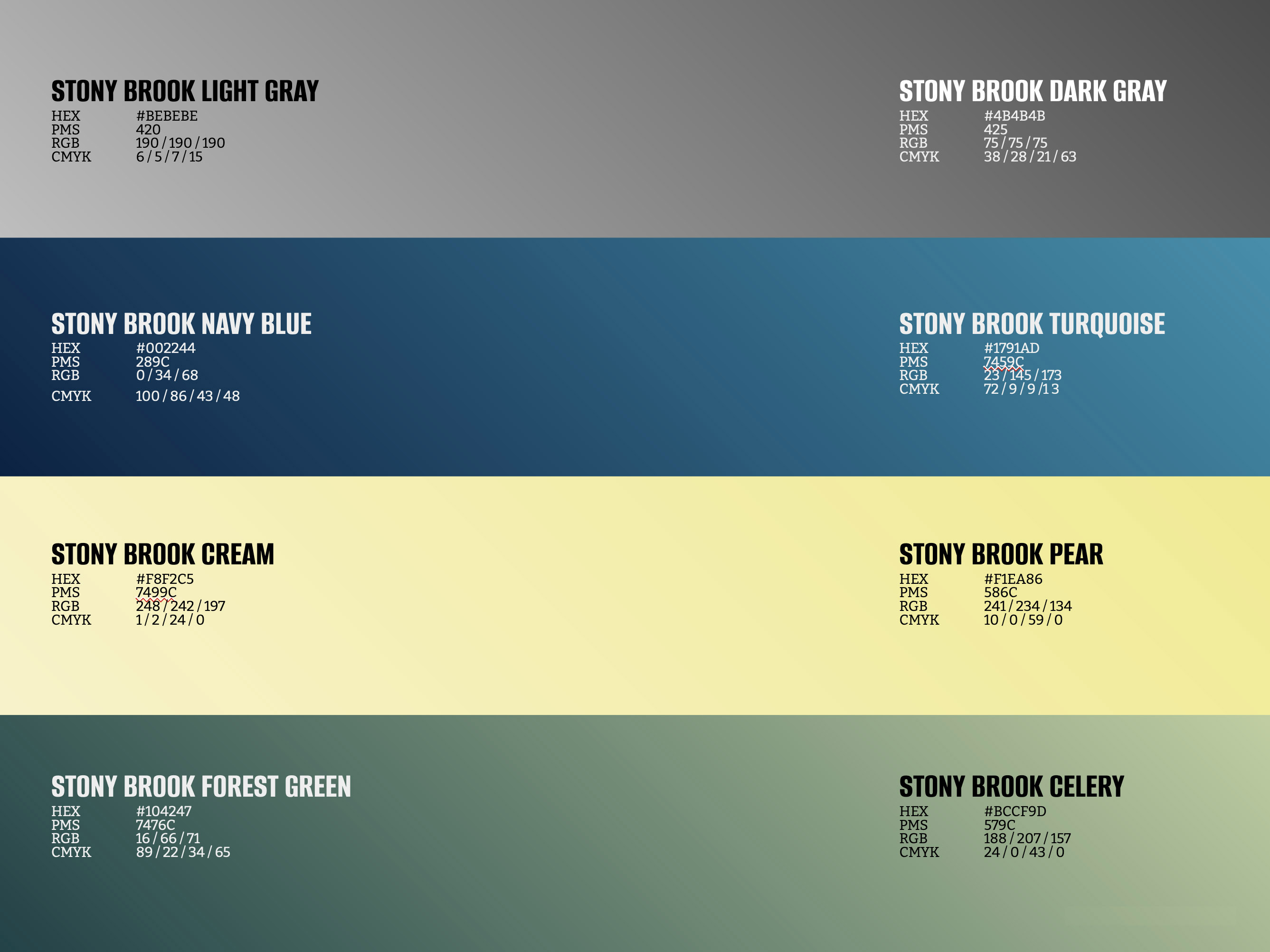
| STONY BROOK DARK GRAY For digital: HEX #4B4B4B RGB 75/75/75 For print: PMS 425 CMYK 38/28/21/63 |
STONY BROOK TURQUOISE For digital: HEX #1791AD RGB 23/145/173 For print: PMS 7459C CMYK 72/9/9/13 |
||
| STONY BROOK MEDIUM GRAY For digital: HEX #828282 RGB 130/130/130 For print: PMS 423 CMYK 18/14/14/38 |
STONY BROOK PEAR For digital: HEX #F1EA86 RGB 241/234/134 For print: PMS 586C CMYK 10/0/59/0 |
||
| STONY BROOK LIGHT GRAY For digital: HEX #BEBEBE RGB 190/190/190 For print: PMS 420 CMYK 6/5/7/15 |
STONY BROOK CELERY For digital: HEX #BCCF9D RGB 188/207/157 For print: PMS 579C CMYK 24/0/43/0 |
||
| STONY BROOK FOREST GREEN For digital: HEX #104247 RGB 16/66/71 For print: PMS 7476C CMYK 89/22/34/65 |
STONY BROOK CREAM For digital: HEX #F8F2C5 RGB 248/242/197 For print: PMS 7499C CMYK 1/2/24/0 |
||
These colors play a supporting role in the brand hierarchy. They are only to be used in support of the primary colors, and may be paired with each other to achieve a more dynamic design. Proportion of reds to non-red secondary colors should be 80:20. This can be achieved through the Prisms in addition to other elements in the design.
Primary Gradients
Gradients are used to elevate a design by providing depth and space to a composition.
For Dare To Be, primary gradients may be made by combining two HEX, CMYK gradients or RGB Stony Brook Red values (see secondary colors). A gradient tool is available in most design programs and platforms.
Stony Brook gradients are always linear; never radial. The angle of the linear gradient should be between 70° and 20° to ensure the gradient always appears to move up and to the right.
Secondary Gradients
Secondary Stony Brook colors of the same family may be paired to create a secondary gradient (grays with grays, blues with blues, greens with greens, etc.)
Like secondary colors, secondary gradients should always be used in support of the primary Stony Brook colors and gradient.
Secondary gradients follow the same rules as the primary gradients; linear and always up and to the right, between 70° and 20°.
Color Accessibility
Contrast between content color and background color is crucial for legibility, especially for individuals with visual impairment.
The WCAG (Web Content Accessibility Guidelines) ensures that content is accessible to everyone, regardless of disability or user device. To meet these standards, visual elements should have a color contrast ratio of 4.5:1 or greater. Shown below are some examples of acceptable contrast.
Check contrast at: webaim.org/resources/contrastchecker
ACCESSIBLE TEXT COLORS |
|
| WHITE TEXT ON STONY BROOK BLACK | WHITE TEXT ON STONY BROOK RED |
| WHITE TEXT ON STONY BROOK DARK RED | WHITE TEXT ON STONY BROOK BRIGHT RED |
| WHITE TEXT ON STONY BROOK NAVY BLUE | WHITE TEXT ON STONY BROOK DARK GRAY |
| BLACK TEXT ON STONY BROOK MEDIUM GRAY | BLACK TEXT ON STONY BROOK LIGHT GRAY |
| WHITE TEXT ON STONY BROOK ROYAL BLUE | BLACK TEXT ON STONY BROOK TURQUOISE |
| BLACK TEXT ON STONY BROOK PEAR | WHITE TEXT ON STONY BROOK FOREST GREEN |
| BLACK TEXT ON STONY BROOK CELERY | BLACK TEXT ON STONY BROOK CREAM |
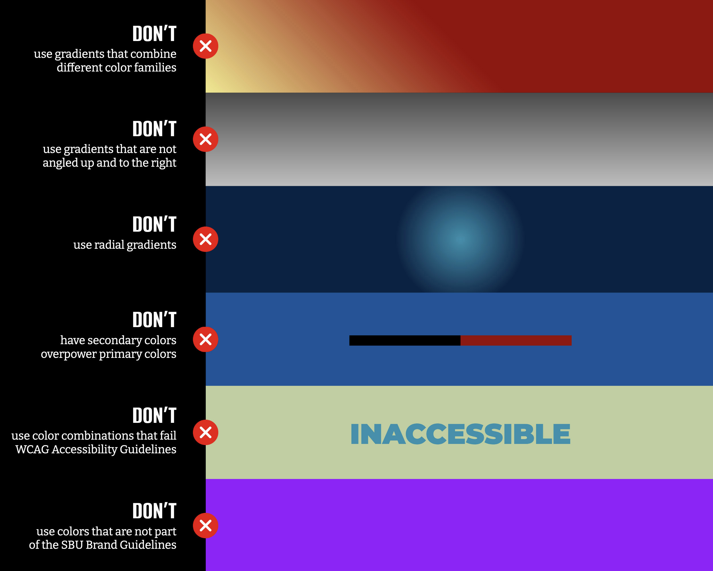
Color Don'ts
These are color applications that DO NOT align with the SBU Brand Guidelines:
- DON'T use gradients that combine different color families
- DON'T use gradients that are no angled up and to the right
- DON'T use radial gradients
- DON'T have secondary colors overpower primary colors
- DON'T use color combinations that fail WCAG Accessibility Guidelines
- DON'T use colors that are not part of the SBU Brand Guidelines