LIRR STRIKE: The LIRR is on strike, disrupting the ability for commuters to get to and from the Stony Brook campus. More details here.


Fall 2025 Emerging Artist Residency | "The Room" - Dean Arlen and Adele Todd


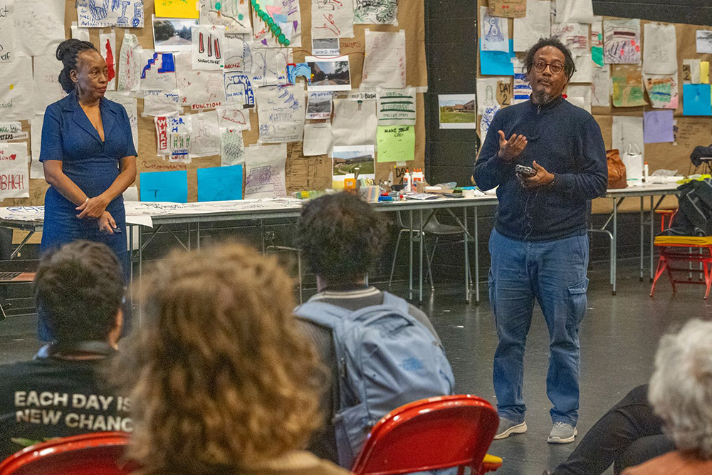
Caribbean artists Dean Arlen and Adele Todd (Trinidad and Tobago) completed a 12-day residency at Stony Brook University, collaborating with students to reimagine how the Staller Steps might be used. Their project, The Room, was presented as part of the Humanities Institute Visiting Artist Series, organized by the College of Arts and Sciences’ Center for Changing Systems of Power (CCSP) and the Department of Sociology.

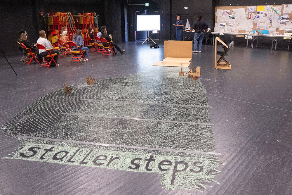
During their residency, the artists converted Staller Theater One into an open studio space, inviting students, faculty, staff, and community members to take part in drawing exercises and discussions centered on redesigning the Staller Steps. Through these activities, Arlen and Todd encouraged participants to explore the intersections of art, social justice, and inclusion.

The residency concluded with the creation of a proposal: a physical document assembled by the artists in collaboration with student participants. It was presented to the university president and provost, and deposited in the campus library for archival preservation. The document stands both as a record of the collaboration and as a call to action for future planning efforts.


Proposal - Staller Steps, Stony Brook University

An architectural proposal map for Staller Steps at Stony Brook University, featuring red markings highlighting pathways and areas around a central complex.

Aerial images of Staller Steps at a university campus are shown. The current colored photo on the left highlights green spaces, benches, and pathways. On the right, a black-and-white historic photo shows the campus under construction, surrounded by trees, conveying a sense of growth and development over time.


RESPECT

As visitors to THIS LAND we acknowledge our INDIGENOUS
brothers and sisters - we also
give respect to the INDIGENOUS
brothers and sisters of THIS LAND


THE MANIFESTO

THEROOM, is a methodology seeking authentic aesthetic that pulls from geography and urban planning participatory modules to invoke authentic visual stimuli. I have used this method in communities to find authentic forms.

THEROOM as a safe space has become this personal metaphor for the “consultations” in my country, “consultations” have become co opted by party politics and state performances around community and national development has become problematic.

THEROOM challenges this political performance by allowing people to see their voice in action and in the deliberate making of authentic aesthetics and development.

THEROOM pushes at that boundary and forces a conversation with traditional notions of where the artist can sit.

The notion of fluidity is an ever evolving thing and is happening as we speak internationally.

This question of authenticity is still a very dynamic thing within marking and making, the ego is powerful and tempering it takes work. If we are to arrive at vernacular, créolité, hybridity the source that belongs to space has to be heard.

THEROOM seeks to explore that space between the artist and voice.

For the artist’s community it pushes the academy, the artist’s community, the state, corporate and finally the
community to expand their perspective on the ‘Artist.’ Within the development paradigm the Artist must be considered within the structure of national development.

We the Artists in Trinidad and Tobago, are usually the last in the development line.

Economics, law, science,architecture, industrial design, then the visual artist.

THEROOM methodology challenges this paradigm.


Introduction

Dean Arlen and Adele Todd are Artists working and living in Trinidad and Tobago. Dean Arlen is an Installation Artist who focuses on creating community playspaces.

He uses Participatory Mapping to engage the public to create authentic visions for environmental spaces.

Adele Todd is a Lecturer, Performance Artist, Enbroiderer and Graphic Designer working with Dean Arlen to bring the proposal for The Staller Steps to life.

JOIN THEIR JOURNEY come to THE ROOM


The Staller Steps artdesign proposal

To the east sits a large square monolithic entrance, hard lined, brown stone, creating an amazing pathway to the Wang Center, running off to the south is the music department building, bricked, installed neatly, BLOCK. The building cuts into the skyline, sharp bladed infrastructure, off the building are steps running north to south, intermittently lined by blue bins, guarding structuralism, the bins themselves are harsh, blue, sturdy, wired to be weathered; they’re much. There is no difference to the west, least there are trees running north from the Staller Center for the Arts to the southern end giving an aura of softness.

This softness, that structuralism bellows an aesthetic intervention.

The proposal allows two space to coexist, juxtaposing the two northern tips… one, the north western side with nature and the north eastern side with a sculptural collaged form,creating community participation, two space become softer in their performance.

The two main spaces expands further into the Staller Steps by offering a vernacular to practice.


THE ROOM. The methodology of refining the Staller Steps

Colorful schedule chart titled "Conceptual Hours" with a grid layout. It includes events like gallery visits, seminars, and artist talks spanning September 29 to October 5, with activities marked in different colored boxes and arrows indicating times.


Collage of handwritten notes and drawings on paper, featuring words like "CLIMB HIGH" and "CONNECT." Themes include creativity and encouragement.

Collage depicting a creative workshop on urban planning. Includes sketches of trees, greenery, detailed maps, and participants interacting, with a text overlay: "DAY 2: Further Investigation and Participation."

Collage of artistic sketches and colorful designs on a brown paper background. Text reads "Day 3: Drilling down and IDEATING further." Creative and dynamic atmosphere.


THE PROPOSAL

Listening to THE VOICES of the participating students

COLOR | COMMUNITY | CURVES | INTIMACY | ENVIRONMENT | ACCESIBILITY

Left: A large brick building with trees partially obscuring the view. Reads below: "Taking into account THE SEASONS – COLOR, COMMUNITY, CURVES, INTIMACY, ENVIRONMENT AND ACCESIBILITY.” Right: An inset drawing shows a whimsical arch-like structure, contrasting with the building’s formality. Reads below: “Creating a dramatic entrance – softening the hard lines using both materials and the flow of people to The Staller Theater space – THE ENTRANCE creates the SEVEN ZONE Journey of adventure in materiality, making, marking and craftshing of a space.”

A landscape architecture design presentation showing a before-and-after comparison of a campus outdoor space. On the left, the existing condition features a series of wide, tiered grass terraces with concrete retaining walls and steps, flanked by brick academic buildings and mature trees under a partly cloudy sky. A few people are seated on the terraces. On the right, the proposed design overlay introduces three types of seating elements annotated with callout boxes: "Three Stoops" designed for individual use with colorful pop seating, "Three Stoops" designed for sitting back or laying back, "Movable Seating," and "Organic Seating," illustrated with gestural line-drawing sketches of reclining and lounging figures alongside a rendering of a pink organic-form seat. Text at the bottom of the left panel reads: "Taking into account THE SEASONS – COLOR, COMMUNITY, CURVES, INTIMACY, ENVIRONMENT AND ACCESSIBILITY."

**Alt text:**  A landscape architecture design presentation showing a before-and-after comparison of a campus outdoor space photographed from ground level with a mobile phone (labeled "Galaxy A32"). On the left, the proposed design concept is overlaid onto a photo of tiered grass terraces with concrete retaining walls, a central paved pathway, and a large brick academic building in the background under a blue sky with scattered clouds. Three annotated callout boxes with gestural line-drawing sketches illustrate seating concepts:  - **"Three Stoops: One for the individual"** — noting that the arrangement allows for further softening of the space and can provide pops of color. - **"Community Seating"** — described as arranged to create contours, color, and group meetings, with a note that students have drawn attention to the lack of accessibility for the differently abled, marked as needing urgent attention. - **"The Berm – features THE PILLOW"** — described as a cocooning environment that plants can also grow inside, with three configurations: Short for just the head, Medium for half torso, and Full Body for semi-private use, made of mesh material.  On the right, the existing condition photo shows the same space without any design overlays — the same terraced lawn, pathway, and building visible in autumn foliage. Text at the bottom reads: *"Taking into account THE SEASONS – COLOR, COMMUNITY, CURVES, INTIMACY, ENVIRONMENT AND ACCESSIBILITY."*

**Alt text:**  A landscape architecture design presentation showing a before-and-after comparison of a covered underpass or ground-floor passage beneath a brick academic building. The space has a low concrete ceiling, hard floors, and opens to the exterior on both sides.  On the left, a hand-drawn perspective sketch is overlaid on the existing photo, depicting proposed organic, curvilinear seating forms — large, looping, sculptural chair-like objects with fluid, coiled silhouettes — placed within the underpass space. Four white lines point from a caption block to the individual seating elements in the drawing. The caption reads:  - **"This space is called THE DEAD ZONE — it is usually dark and used as a utility space. Students do sit on metal table/chair combinations to work."** - **"Adventurous seating livens up a DEAD ZONE by adding Color, Softness, Texture and Curves."**  On the right, the existing condition photo shows the same underpass as it currently exists — dim, utilitarian, with a red piece of equipment (possibly a floor machine or generator) and a few standard black metal table-and-chair sets scattered on the concrete floor. The space appears dark, unwelcoming, and purely functional.  Text at the bottom right reads: *"Taking into account THE SEASONS – COLOR, COMMUNITY, CURVES, INTIMACY, ENVIRONMENT AND ACCESSIBILITY."*

**Alt text:**  A landscape architecture design presentation showing a before-and-after comparison of an exterior wall of a campus music building. The building has a dark, angular modernist facade with large glass windows and the word "MUSIC" visible on the exterior.  On the left, a photo of the existing condition shows the building's plain, dark cantilevered wall meeting a concrete plaza — stark, unwelcoming, and bare.  On the right, a detailed hand-drawn sketch is overlaid, proposing a large-scale **Greening Wall** mural or living wall installation across the building's facade. The drawing features sweeping organic, curvilinear forms — flowing botanical and abstract shapes with red accent figures that resemble stylized human or flame-like forms — covering the wall surface. Three white lines connect the existing photo on the left to corresponding elements in the proposed sketch on the right.  A small inset box in the lower right corner shows a close-up detail of a repeating decorative pattern described as **"THE PATTERNING"** — an intricate, circular, nature-inspired motif noted as versatile enough to be reprinted on all design elements throughout the seven zones.  Caption text at the bottom reads:  - *"These art/design proposals insist that the community becomes one with the artwork, creating a larger aesthetic. ORGANIC in structure, this piece is inclusive of the craft of the Indigenous Peoples. It is also the voice of the students asking for graffiti. The materiality for this GREENING WALL is interdisciplinary in nature, pulling from several sources."* - *"Taking into account THE SEASONS – COLOR, COMMUNITY, CURVES, INTIMACY, ENVIRONMENT AND ACCESSIBILITY."*

**Alt text:**  A landscape architecture design presentation showing design concept sketches alongside existing-condition photographs of a campus passageway, captured on a mobile phone (labeled "Galaxy A32") under a dramatically overcast, hazy sky.  On the left, a large inset sketch board overlaid on a dark photo of the building exterior presents two hand-drawn design concepts:  - **Left sketch — "The Nature Arch":** A detailed pencil drawing showing a tall, arched trellis structure draped in cascading vines and vegetation, with a small human figure drawn to scale at the base for proportion reference. Dimension annotations are marked in red (noting approximately 20'4" height and 46" and 149" widths). Caption text reads: *"THE NATURE ARCH is envisioned to create a lush vine cocooning articulated to support the growth of vegetation thus setting up an intimate space. The NATURE ARCH has several aspects to it: 1. To support vegetation. 2. To attract birds and wildlife. 3. To allow people to once again find intimate spaces within the structure."* Labeled **"AVERAGE MEASUREMENTS"** in stylized handwriting.  - **Right sketch — "The Patterning":** A fluid, organic pattern drawn in red/orange ink featuring intertwining vines, leaves, and botanical forms. A note reads: *"PATTERNING TO BE SCULPTURED ON SURFACE OR DОРEMAS."* A second caption states: *"THE PATTERNING to the right is another example of the vernacular to be imprinted on all of the design elements throughout the SEVEN ZONES. The decorative imagery provides COLOR, is ENVIRONMENTAL, COMMUNITY driven, TEXTURED and INTIMATE."*  On the right, two side-by-side photos show the existing campus passageway — a dark, covered walkway flanked by the angular modernist music building wall and rows of metal bicycle racks, framed by trees against a smoky, orange-tinted sky.  Text at the bottom right reads: *"Taking into account THE SEASONS – COLOR, COMMUNITY, CURVES, INTIMACY, ENVIRONMENT AND ACCESSIBILITY."*

**Alt text:**  A landscape architecture design presentation showing a before-and-after comparison of a campus building entranceway, photographed at ground level with a mobile phone (labeled "Galaxy A32") in warm evening light. A "NY ORCHESTRA" banner is visible on the left wall of the building, and the passage opens to a bright exterior beyond.  On the left, the existing condition photo shows the underpass entrance with plain concrete walls, a few standard wooden picnic tables, and utilitarian red equipment stored near the back — functional but stark and unwelcoming.  On the right, three overlaid design concept elements are presented:  - **Center sketch — "The Snake":** A large pencil drawing overlaid on the photo depicts a sweeping, sinuous sculptural seating element called **THE SNAKE** — an organic, arch-like continuous form with coiling, serpentine lines that winds through the entranceway space. Red grid lines indicate scale and proportion. Two white lines point from caption text to specific features of the drawing. The caption reads: *"THE SNAKE slithers from east to west in the main entranceway. It is envisioned to connect all the main tributaries. THE SNAKE is designed to create sound and echoes from the wind that circulates through the round body of its shape. THE SNAKE also connects the seating that is also part of the WALL TAPESTRY. The decorative imagery provides COLOR, is ENVIRONMENTAL, COMMUNITY driven, TEXTURED and INTIMATE."*  - **Center-right label:** *"COMMUNITY SEATING and example of the WALL TAPESTRY that is connected to THE SNAKE."*  - **Far right sketch — "The Patterning":** A vertical strip of the recurring organic botanical pattern — the same vernacular motif referenced in prior panels — shown as it would appear printed or sculpted onto wall surfaces, captioned: *"THE PATTERNING above is another example of the vernacular to be reprinted on all of the design elements throughout the SEVEN ZONES."*  Text at the bottom left reads: *"Taking into account THE SEASONS – COLOR, COMMUNITY, CURVES, INTIMACY, ENVIRONMENT AND ACCESSIBILITY."*

**Alt text:**  A spread from a design presentation booklet showing pages 40 and 41, titled **"Some early sketches"** with a sub-caption reading: *"The two images convey the PROCESS in developing and coming to terms with the directives of this fieldtrip. These ideas are still in the process of development."*  **Left page (page 40):** A loose, expressive pencil and watercolor sketch depicting an early conceptual vision for the campus entranceway. Large arching trellis or sculptural forms dominate the composition, with cascading organic shapes, flowing vine-like lines, and layered tree and building silhouettes in the background. Soft pink and green watercolor washes add atmospheric color. Smaller secondary sketches in the lower right suggest additional seating or landscape element ideas. The overall drawing is energetic and gestural, communicating the early exploratory phase of the design.  **Right page (page 41):** A more developed and color-saturated version of a similar composition. The same arching structural forms are now rendered with bold red and green marker, giving the organic elements — loops, tendrils, hanging forms, and sculptural seating — a vivid, three-dimensional quality. Yellow oval forms suggest lighting or decorative elements suspended within the structure. A word that appears to read **"STAIRLE"** or similar is partially visible at the lower left. A caption at the bottom reads: *"Applying color and organic forms are essential to the softening of the hard environment."*  To the far right, two additional smaller gesture sketches on loose paper show vertical, totem-like stacked organic figures — further exploratory studies of sculptural form and proportion.

**Alt text:**  A spread from a design presentation booklet showing pages 42 and 43, titled **"Another view into the artdesign process."**  **Left page (page 42):** A precise, clean pencil perspective drawing of the campus underpass or entranceway rendered in one-point perspective. The drawing carefully delineates the architectural geometry of the space — the receding ceiling grid, flanking walls, columns, and floor plane — establishing the spatial framework into which the proposed design interventions will be placed. The drawing is purely structural with no organic or decorative elements added, functioning as a technical base study of the existing architecture.  **Right page (page 43):** A collage of four photographs documenting the hands-on design process:  - **Top left:** A photo of a densely covered cork bulletin board or studio wall covered with pinned sketches, notes, color swatches, photographs, and index cards in various colors — a working design studio pinboard showing the breadth of research and ideation material gathered during the project. - **Top center:** A close-up photo of a designer's hand actively drawing with a pen on paper, with red wire or cord twisted into organic looping forms placed directly on the drawing surface as a three-dimensional sketching tool — suggesting the use of physical materials to work out the curvilinear forms of **The Snake** design. - **Top right:** A partial exterior photo of the campus brick building, providing site context. - **Bottom right:** A small mixed-media collage or study mounted on red paper, showing a dark rectangular form — possibly an early abstract compositional study or material sample.  A caption at the bottom reads: *"THIS IMAGE gives an idea of the evolution of the slithering movement of THE SNAKE which was influenced by the red ARCH drawing from a student's sketch included on the left and was then made into an iteration developed on the RIGHT."*

**Alt text:**  A landscape architecture design presentation page from a booklet (pages 44–45) showing an aerial satellite view of the **Staller Steps** at Stony Brook University, with eight proposed design interventions mapped and labeled across the tiered lawn terraces. Surrounding campus landmarks are visible in the dimmed aerial background, including the Stony Brook University Alumni Association, Lawrence Alloway Gallery, FedEx Office Print & Ship Center, Stony Brook University Department of Music, and a Stony Brook Film Festival banner on a nearby building.  The left side of the image introduces the concept with the heading **"Eight Items"** and the explanation: *"These Eight Items create an immediate shift in the Contour, Color and Ambiance of the Staller Steps."*  Each of the eight items is marked on the aerial map with a small color-coded illustrated tile connected by a white line to its label. The items are distributed across the terraced lawn and listed as follows:  1. **The Berm Pillow** — upper center of the terraces 2. **Cocoon** — upper left area of the terraces 3. **Recline** — middle left area of the terraces 4. **By2 Sofa seating** — upper right, near the top of the steps 5. **Stoop** — right side, mid-terrace 6. **Bin** — lower right area of the terraces 7. **Lay Back seating** — lower center of the terraces 8. **Accessibility** — lower center, below item 7  Each tile contains a small gestural sketch illustrating the form or posture associated with that seating or furniture type, color-coded in pink, orange, peach, green, teal, and white to differentiate the elements across the map.


Thank you STONY BROOK UNIVERSITY

Manisha Desai, Jessica Infanzon, Erin Kim, Evelyn Cruise, Efrat Hakimi, Lauren Donovan, Nobuho Nagasawa, Karl Bourke, Brooke Belisle, Jessica Raphael, Galia Cozzi Berrondo, Linda O’Keeffe, Andrew Schaeffer, Jason Paradis, Kristen J Nyitray, and the Students of Stony Brook University.


THE ROOM in the News


THE ROOM in the News